Problem
The promise was simple: hold together what looks good and what is comfortable to wear. In everyday womenswear everyone says that, and unproven it goes unheard.
← Work / 04 — 12
An identity where comfort does not read as cheap.
The promise was simple: hold together what looks good and what is comfortable to wear. In everyday womenswear everyone says that, and unproven it goes unheard.
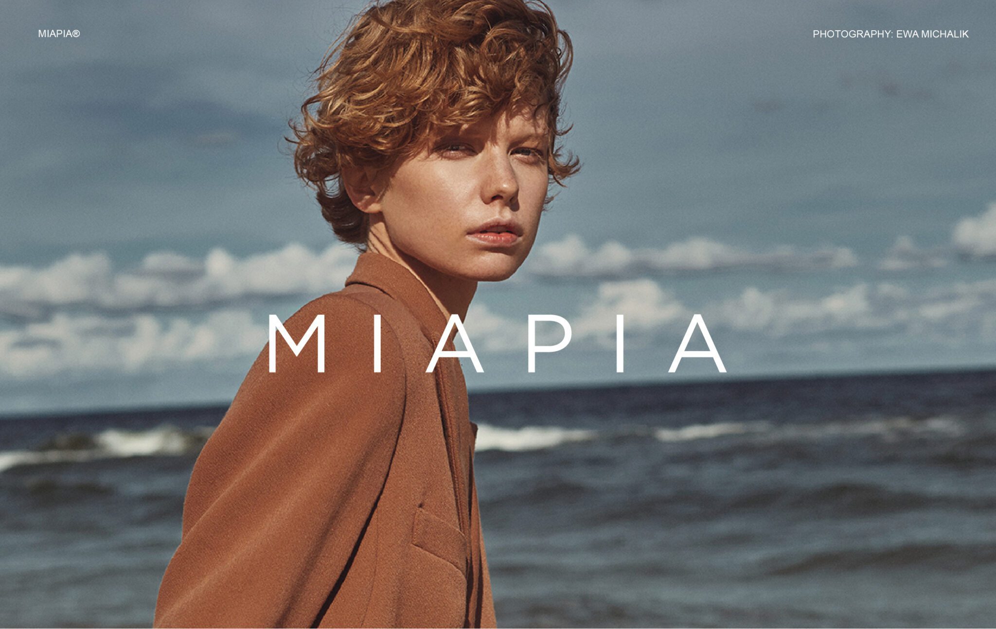
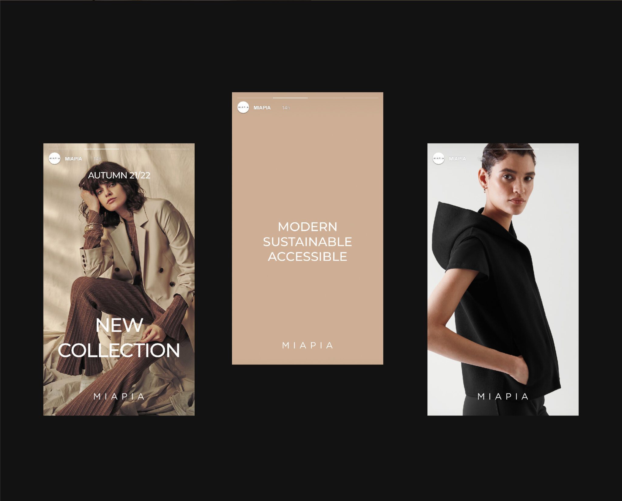
In everyday wear brands beat each other with discounts, and on that axis the fabric and the cut go invisible. Rather than claim the promise, we decided to show it: no promotional language, no saturated colour, no crowded product shots. A light, widely-tracked serif, natural light and generous space, with framing that follows how the garment sits. The comparison moved from price to fabric and fit.
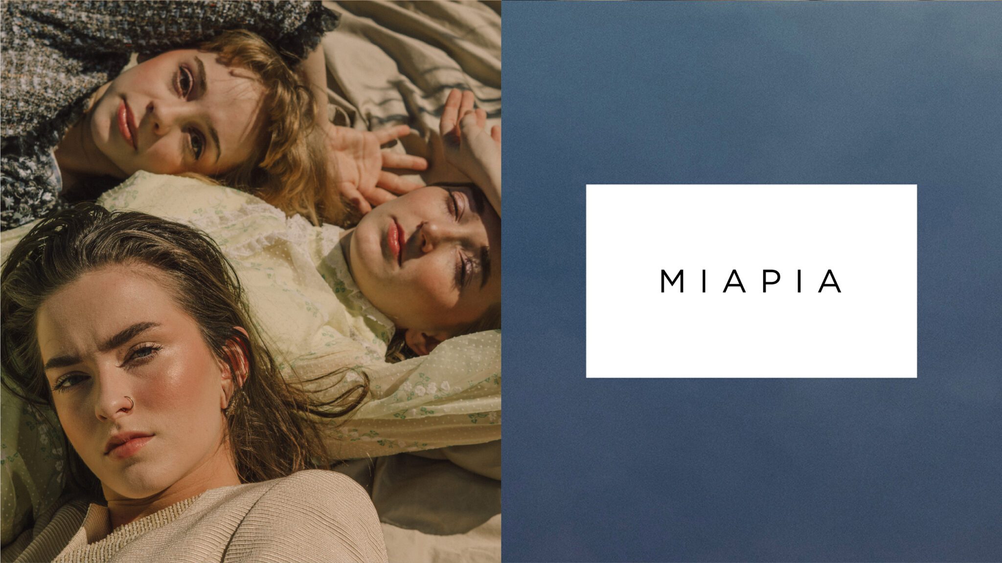
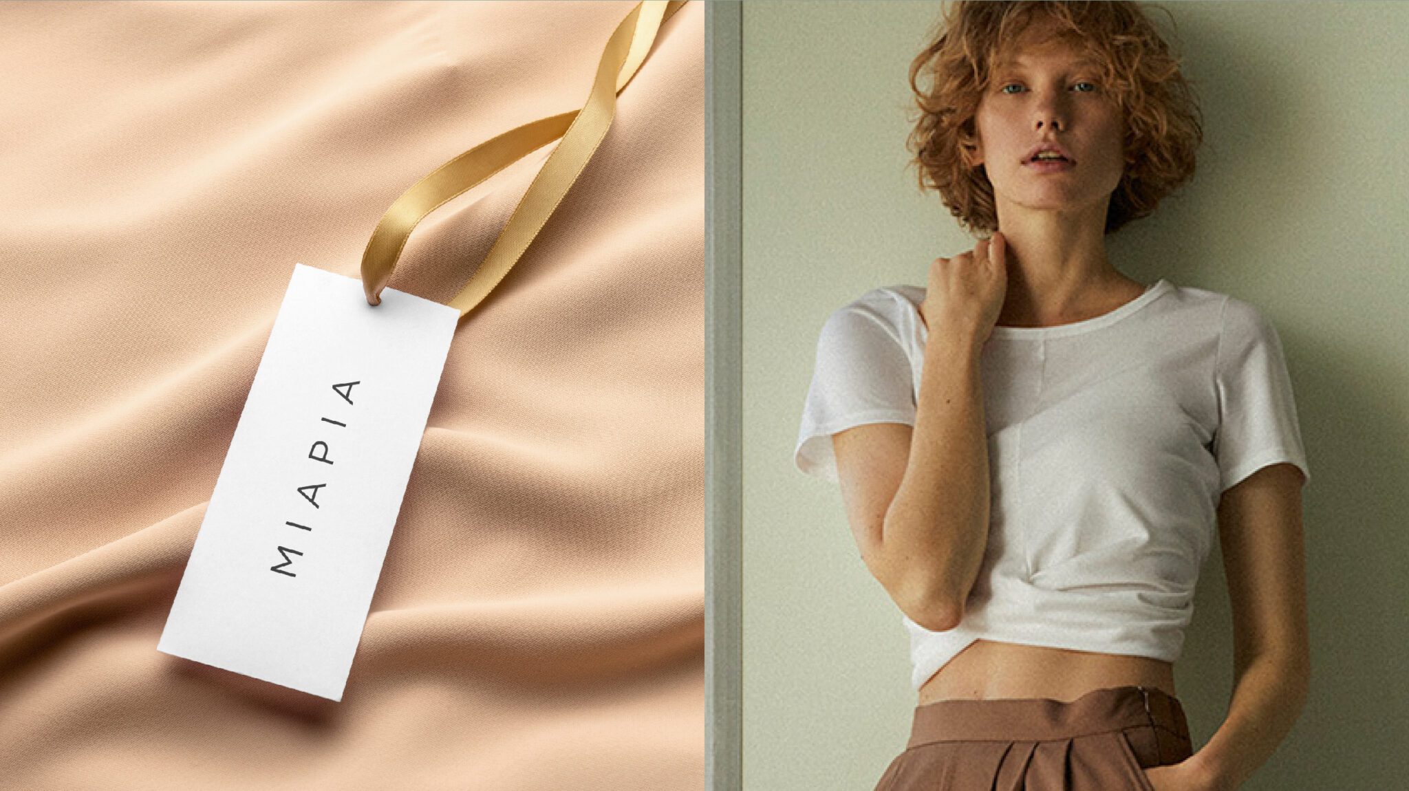
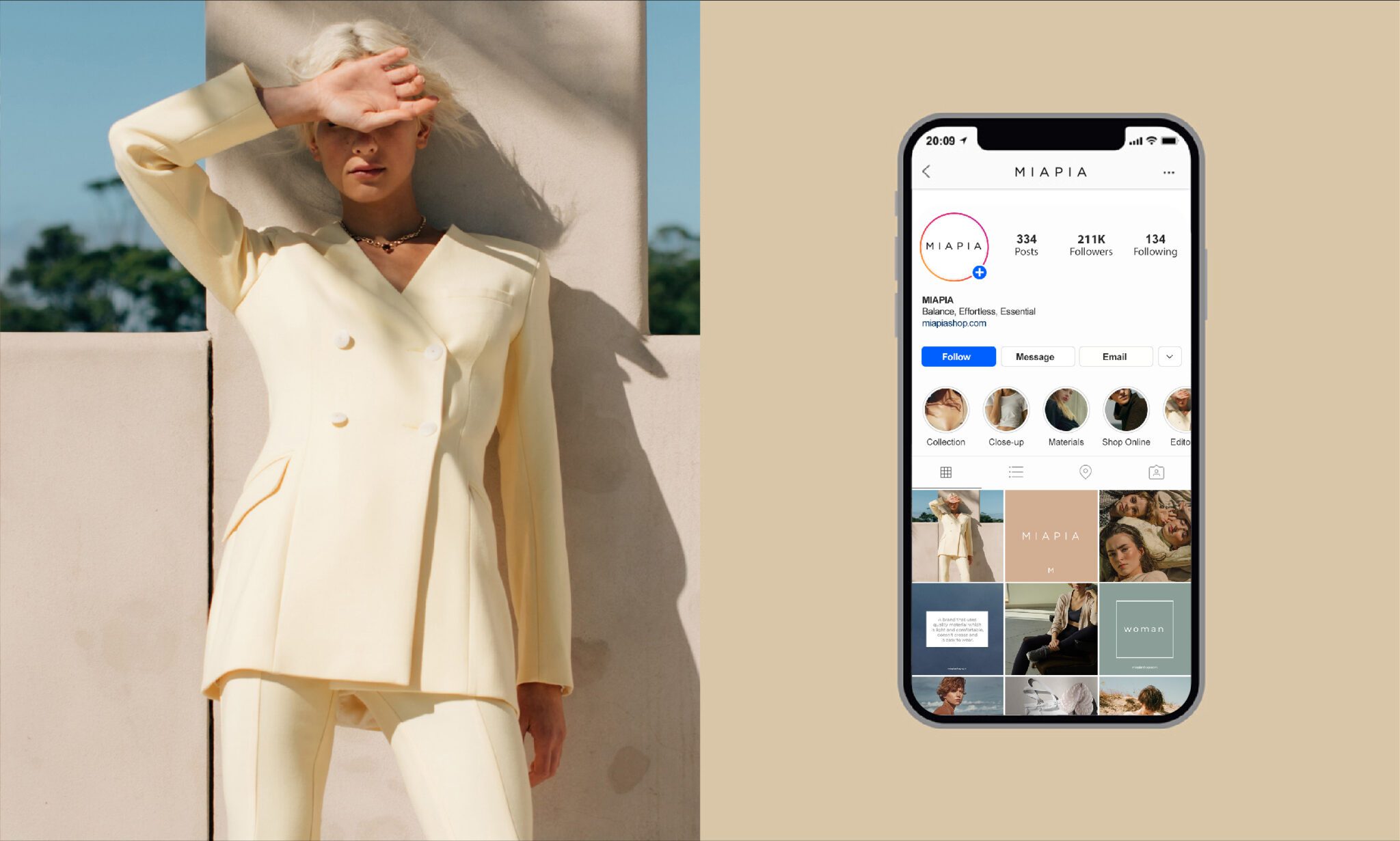
Logotype, garment tags, packaging and art direction for the season lookbook.





 Next projectNES