Problem
Smash burger is on every corner. The product was good; the sign said nothing.
← Work / 01 — 11
Turning a roadside counter into a name you recognise from a distance.
Smash burger is on every corner. The product was good; the sign said nothing.
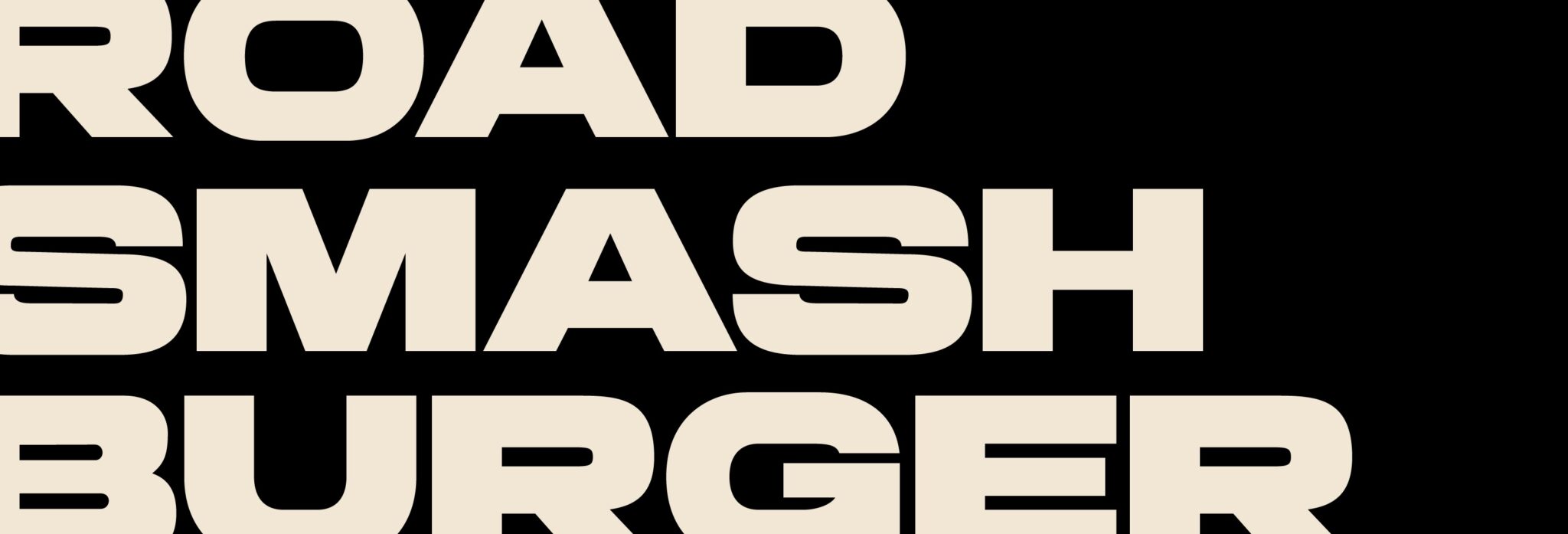
The smash burger category filled up in a few years, and nearly everyone reached for the same codes: black grounds, neon, English “authentic” lines. Instead of matching the category we started from the location — this is not a restaurant, it is a stop on the road. The brand was built on that: a heavy logotype that reads from distance, a script that gives character up close, burgundy and cream. It moved the fight from “whose burger is better” to “the place you remember on the way”.
Logotype, packaging family, sauce labels, signage and store surfaces — all under one set of rules.







 Next projectFlashy