Problem
The product made switching easy, but the story was buried in technical language.
← Work / 07 — 11
Compressing an abstract tech promise into a mark you get at a glance.
The product made switching easy, but the story was buried in technical language.
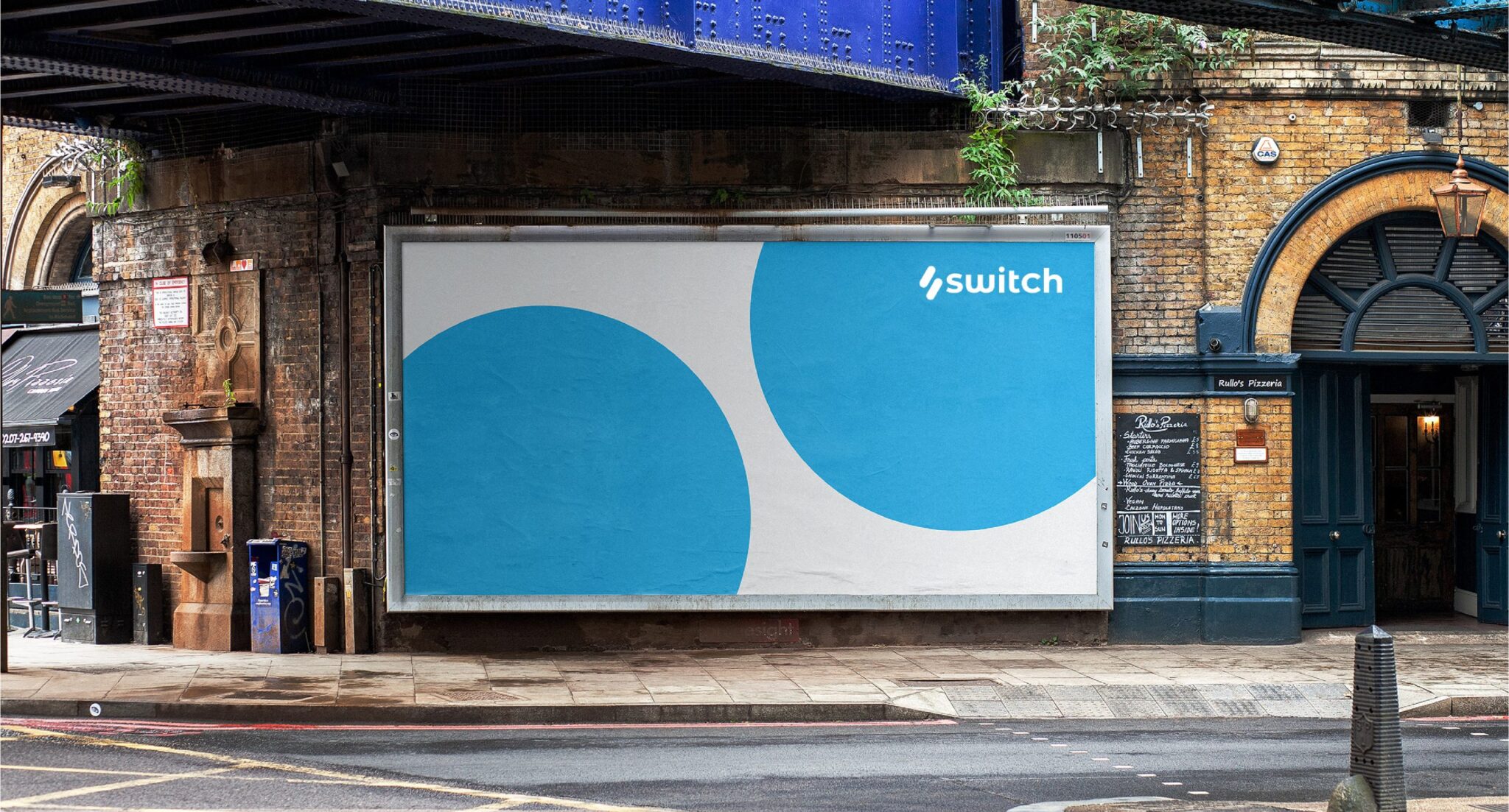
In technology the real barrier is rarely a missing feature; it is switching cost — people hesitate to leave what they already use. So the brand had to sell the ease of the move, not the product. We reduced the mark to a motion rather than an explanation: two circles trading places. Cobalt and cyan were chosen to escape the category’s sea of corporate blue, where colour is an asset rather than decoration.
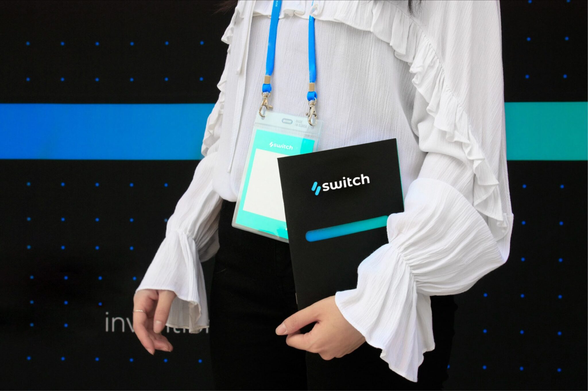
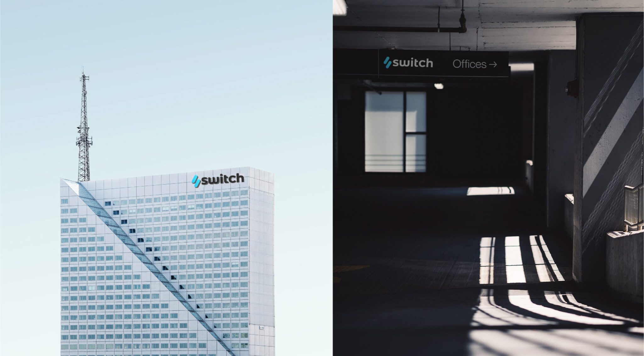
The mark, colour system, app icon, outdoor artwork and templates for digital surfaces.





 Next projectMonomoon®